A Simple React Modal - The Easy Way
By Besufkad Menji
Nov 12, 2020
8 min read
A Simple React Modal - The Easy Way
This mini article will show you how you can create a simple modal component without any third party library. You can use this modal in any react based project; NextJs or Gatsby or even CreateReactApp. Let's get started
This example assumes you’re using a CSS-in-JS styling, obviously you can use any styling method and appropriate it yourself.
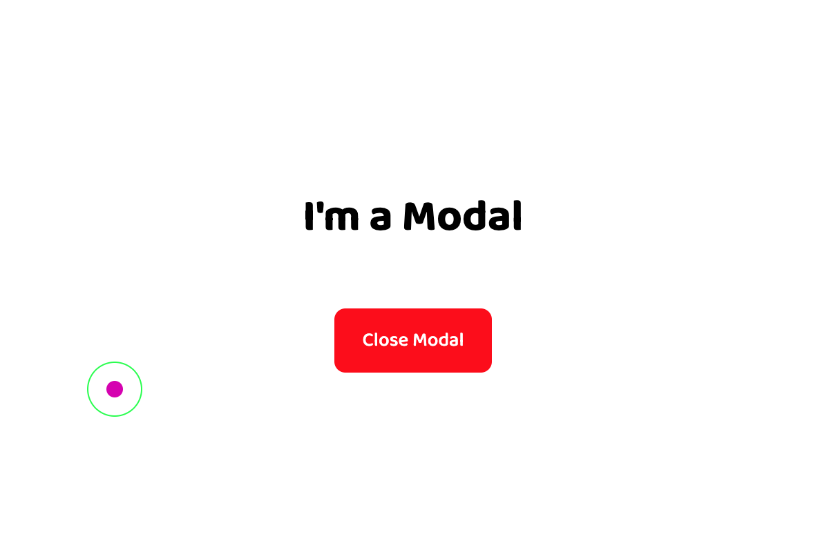
Here is the final result. Try it, seems to work here too.
So to make this modal we need only three elements, possibly divs. div 1: Wrapper for the modal, div 2: Background for the modal, with ability to close the modal, div 3: Content container for the modal, will render children prop.
      export const StyledModalWrapper = styled.div`
            /* Part 1:  bring the modal to front */
            position: fixed;
            z-index: 100;

             /* Part 2:  fill the entire screen with no gap */
            top: 0;
            left: 0;
            height: 100vh;
            width: 100vw;

            /* Part 3:  Can be whatever layout method you want to use  */
            display: grid;
`;
As you can see on the code we have some important css rules. Part 1: The fixed position with high z -index will make sure your modal comes in front of other elements. Part 2: These rules make your modal fill the entire viewport from top to bottom, from left to right with no gap. Part 3: this can be whatever based on your layout strategy
      export const StyledModalBackground = styled.div`
           /* cover the entire screen */
           top: 0;
           left: 0;
           height: 100vh;
           width: 100vw;
           position: absolute;
           background-color: black;
           opacity: 0.7;
`;
We are using this div to create the background of the modal, later we will add a function that will be called when this element is clicked to close the modal. This is the basic experience users expect from a modal.
Since this element is a background we are making it equal with its parent and cover the entire screen from end to end. The background color can be whatever you want just make sure you control the transparency using some opacity.
      export const StyledModalContent = styled.div`
          /* important to make it in front of the background div */
          z-index: 1;

          /* decide the size based on your content */
          height: 60vh;
          min-width: 40vw;
          max-width: 90vw;
          padding: 0 20vw;
          /* decide the background based on your theme */
          background-color: white;

          /* content should be at the center for most times...but you can decide yourself */
          align-self: center;
          justify-self: center;

          /* totally optional stuff */
          border-radius: 8px;

          /* this is your layout strategy for your content... change it based on your design */
          display: grid;
          align-content: center;
          grid-auto-rows: max-content;
          grid-row-gap: 40px;
          justify-items: center;
    `;
This is where the actual modal content will be rendered. This might be a warning or a form or anything that you want to show to the users. The most important part is just the z-index and the size of your container. You can customize this div design based on your need.
So now we have the styling for our modal, let's get back to the js part and create the actual modal.
      export const Modal = ({ children,  open, setOpen, }) => {
            return open ? (
                   <StyledModalWrapper>
                      <StyledModalBackground onClick={() => setOpen(false)}/>
                      <StyledModalContent>{children}</StyledModalContent>
                   </StyledModalWrapper>
                   ) : (
                   <></>
                   );
            };
As you can see our modal accepts three props. Children will be your content and the open and setOpen will be a state to control the modal
<button onClick={() => setOpen(true)}>Open Modal</button>
<Modal open={open} setOpen={setOpen}>
<h1>I'm a Modal</h1>
<button
onClick={() => setOpen(false)}
style={{backgroundColor: "red", color: "white"}}>
Close Modal
</button>
</Modal>
Now you can use the modal like this. Just put the modal in any component and pass the open and setOpen props. You can also create another Custom component based on the Modal and use it for different actions. For instance, Loading and Error components can use this modal and add their custom content, and you will interact with Loading and Error components directly rather than calling the modal like this all the time.
That is it. This is just a simple way for creating a modal. Obviously there are multiple ways, even better ways to create a modal. You can also use a modal package. I will be glad if this helps you in any way. You can find the whole modal component below.